Colour In The Home
Colour as part of the interior design lexicon is an important factor of the design, décor, and final finish of a room. I believe that most people are scared of colour, mostly they are scared of getting it wrong. Colour is a powerful communication tool as well, affecting the mood of people within the room they are in. If we stop to consider what each colour represents and the way that colours work together we can make informed design decisions.
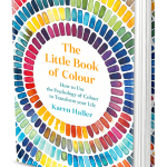
Johann Wolfgang von Goethe, published his Theory of Colours in 1810, was one of the first pioneers of colour theory, he believed that different colours could communicate different qualities and impact us psychologically, affecting our emotions and thoughts. There are also many studies which show that different colour has different effects on us when used in interiors. Obviously you don’t have to use deep tones and hues but can go for gentle tones of the colours which will give you similar effects. More recently than Johann Goethe, Karen Haller has written an excellent book on colour theory: The Little Book of Colour a recommended read if you are interested in colour theory and psychology.
Psychological Effects of Colour
Listed below are some of the effects that colour have been shown to elicit in people:
- Yellow – warm, exciting and happy (increases happiness), optimism
- Blue – deep, peaceful, and supernatural, it has been shown to bring down blood pressure.
- Green – peace, stillness, and nature. It creates a calm and relaxing atmosphere in your home.
- White – harmony, silence, cleanliness and freshness
- Black – grief, dark and unknown, used in moderation can create elegant and bold aspects for your home.
- Red – glowing confidence and alive, often said to boost your energy. Resonant and stimulating often used in dining rooms and kitchens as it is said to increase appetite
- Orange – radiant, healthy, and serious. The warmth of the sun, a cozy and relaxed colour for rooms – especially when used with grey.
- Brown – natural, earth, security, and stability, a neutral colour.
- Grey – the new beige, used as a neutral colour which in different hues looks good with an accent colour
- Pink – often seen as a feminine colour, but in general, has been shown to be a soothing and comfortable colour. Recently has been a colour de jour as it mixes well with the all-pervasive grey!.
People perceive and respond to colours differently. This is mostly cultural, for instance, white in China denotes death while red is life and luck. Here in the UK black is funereal and white is used for nuptials. Consequently choosing colour for your home is fraught with complex issues and choices that we often do not know how to deal with.
Top Tips For Selecting Colour For Your Home
- Light/white ceilings will reflect the light back into a room. Dark ceilings will bring the ceiling down and make a room cozy.
- Look at the tones and hues that you select. Woodwork can be a tone of the wall either lighter or darker or the same colour.
- White is a colour, but don’t just use it because you are scared to make a choice.
- You don’t have to do the whole room in one colour.
- Consider painting alcoves in a deeper colour than the rest of the room. Or have an accent colour on one wall. Accent walls haven’t gone away – yet!
- Look at the colours in the rest of the house and try to make it tone with each room, rather than a sudden jump from shocking colour to shocking colour.
- You can add colour to a room with cushions, throws, rugs, plants, china, and upholstered items of furniture.
- Don’t be scared to use colour.
- Get advice from an Interior Designer or Decorator.


Images from Karen Haller and Little Green Paint
Click here to return to all articles or click left or right headings below to scroll through articles.